PROJECTS
Graffiti Magazine
STREET ART MAGAZINE
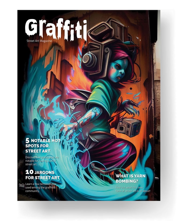
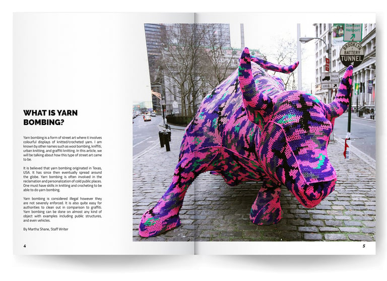
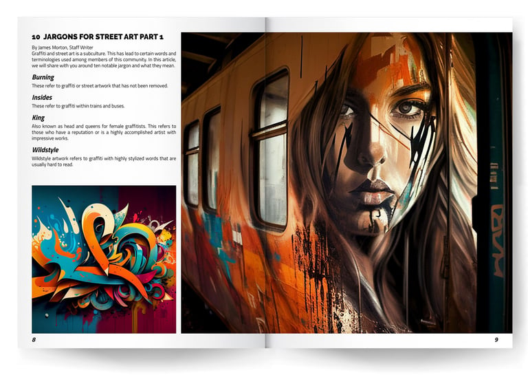
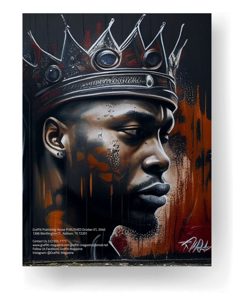
Our bimonthly street art magazine is a dynamic showcase of contemporary urban arts. Beyond graffiti, we embrace diverse street art forms and delve into galleries, trends, and artistic innovation. With a perfect blend of sleek professionalism and trendy flair, we engage a diverse audience, tailored to their unique tastes and preferences.”
WORK PROCESS
NAME SELECTION:
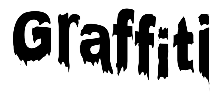
I chose the name “Graffiti” for the magazine, which embodies the essence of street art and immediately captures the reader’s attention. The name reflects the edgy and unconventional nature of the art form while also hinting at the raw creativity that defines the street art movement.
LOGO DESIGN
To craft a logo that resonated with the theme, I opted for a bold Sans Serif font. The choice of Sans Serif ensured maximum readability, a crucial aspect for a magazine title. To infuse the logo with the authentic look of street art, I employed advanced Photoshop techniques. I applied filters and employed the “liquify” tool to manipulate the font’s appearance, creating a visual effect that emulates the texture of painted surfaces. This transformation resulted in a logo that not only symbolizes the graffiti aesthetic but also retains a modern and urban feel.
THE MAGAZINE LAYOUT
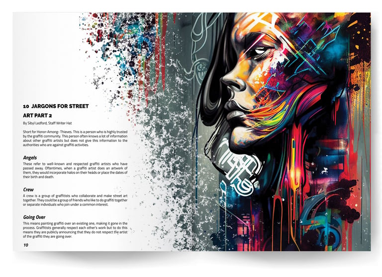
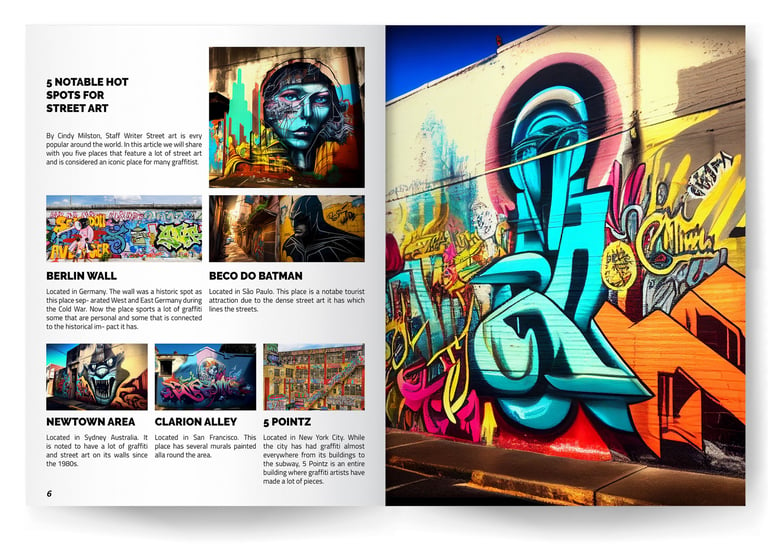
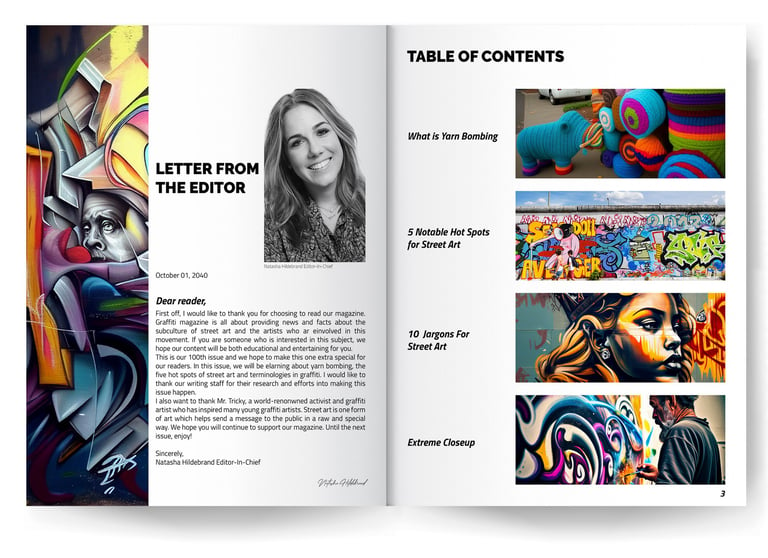
Was carefully designed to reflect the energy and diversity of street art. Vibrant and contrasting color palettes were selected to evoke the vivid tones often found in street art murals.
TYPOGRAPHY
Was strategically employed to complement the magazine’s edgy persona while ensuring readability. Captivating visuals and curated imagery were seamlessly integrated to showcase the captivating world of street art.
PHOTOGRAPHY
In our magazine, we harnessed the power of AI technology, utilizing MidJourney and ChatGPT, to create captivating images that started as written prompts. These AI-crafted visuals were then meticulously upscaled and enhanced, ensuring their impeccable quality for print.




Software Used

Fiat 500
DESCRIPTION:
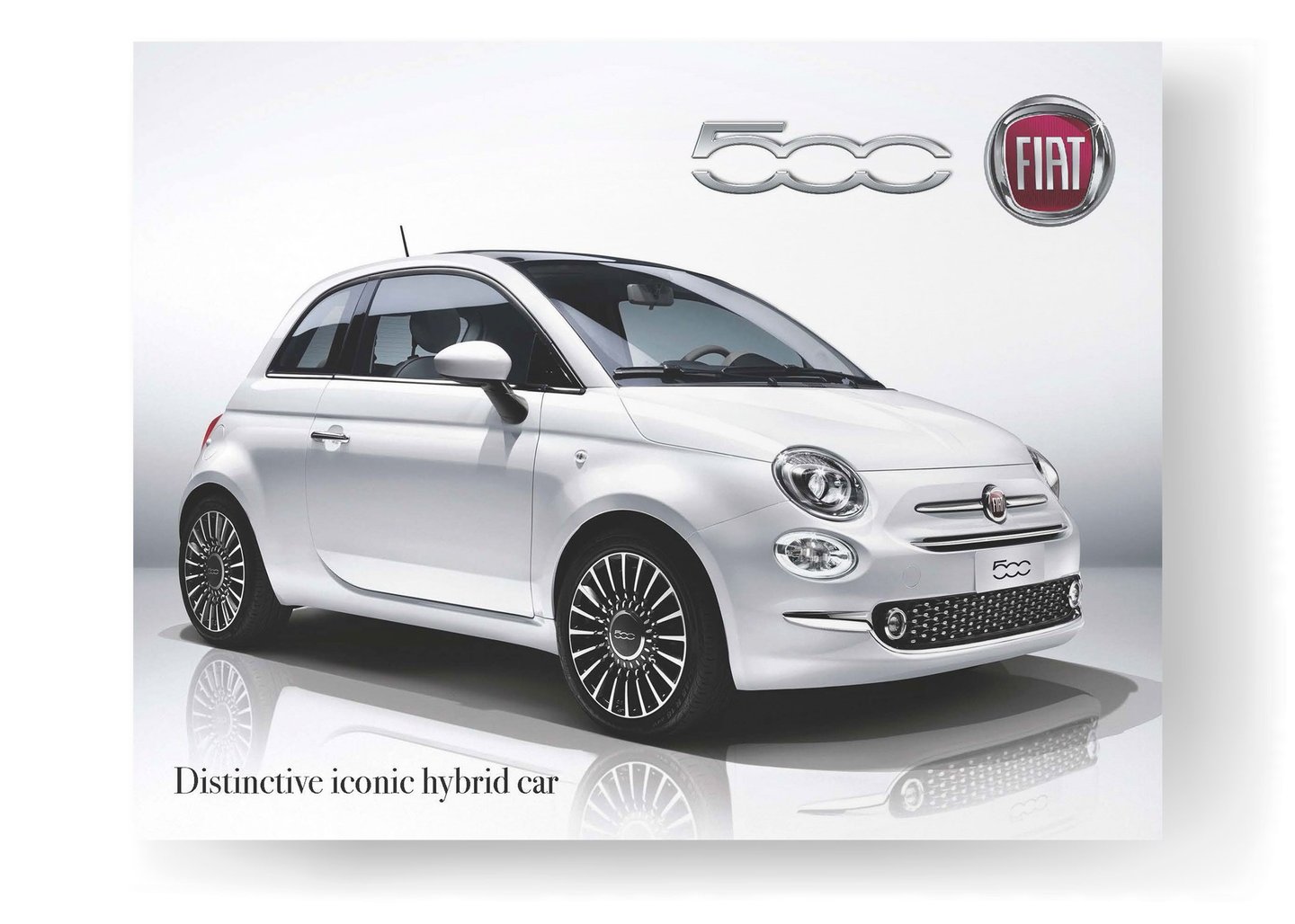
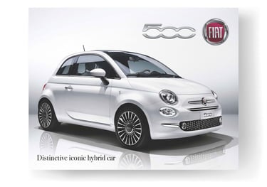
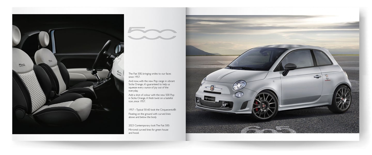
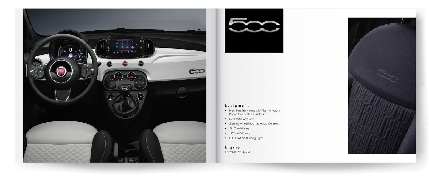
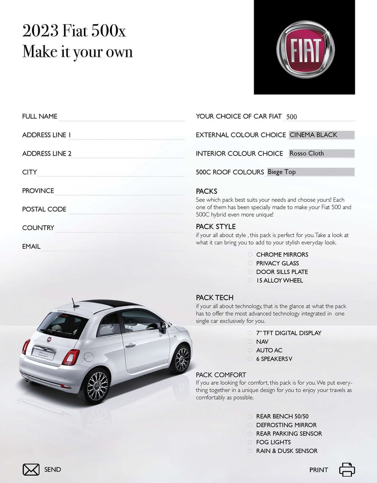
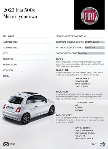
The Fiat 500 2023 Project involves designing a captivating brochure and an engaging interactive form to showcase the features and design of the new Fiat 500 model. The goal is to create an immersive experience for potential buyers, aiding them in customizing their preferences and facilitating purchase decisions.
OBJECTIVES:
Create an attractive brochure highlighting key features and design elements.
Develop an interactive form for personalized customization.
Ensure user-friendly navigation and consistent branding.
Software Used




WORK PROCESS
Project Overview:
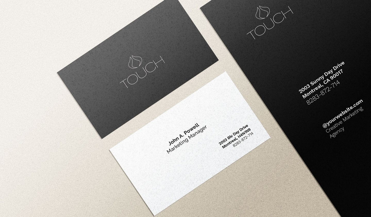
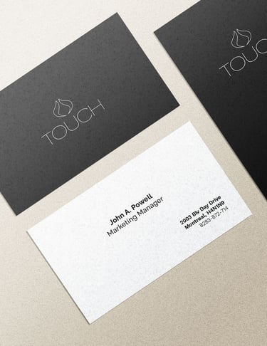
You are tasked with creating a compelling and innovative brand identity for a new product. Your responsibilities include coming up with a unique name for the product, designing a memorable logo, developing cohesive stationery items, and creating an eye-catching poster to promote the product.
Introduction
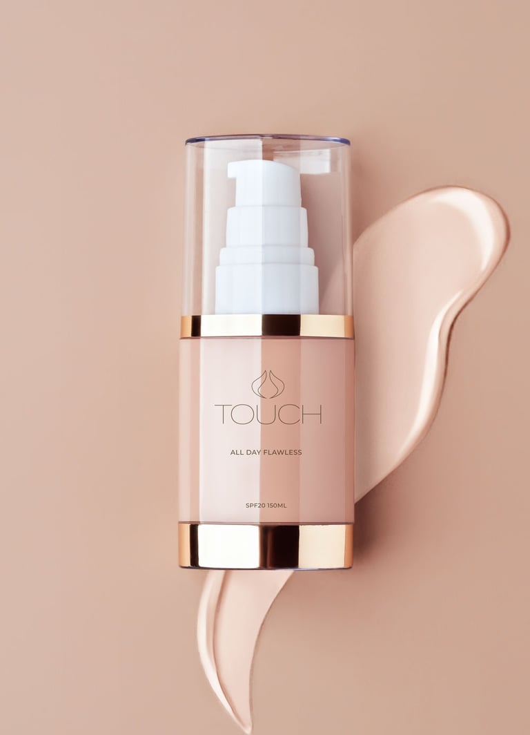
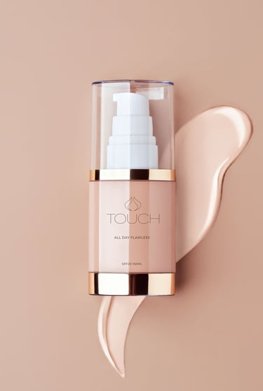
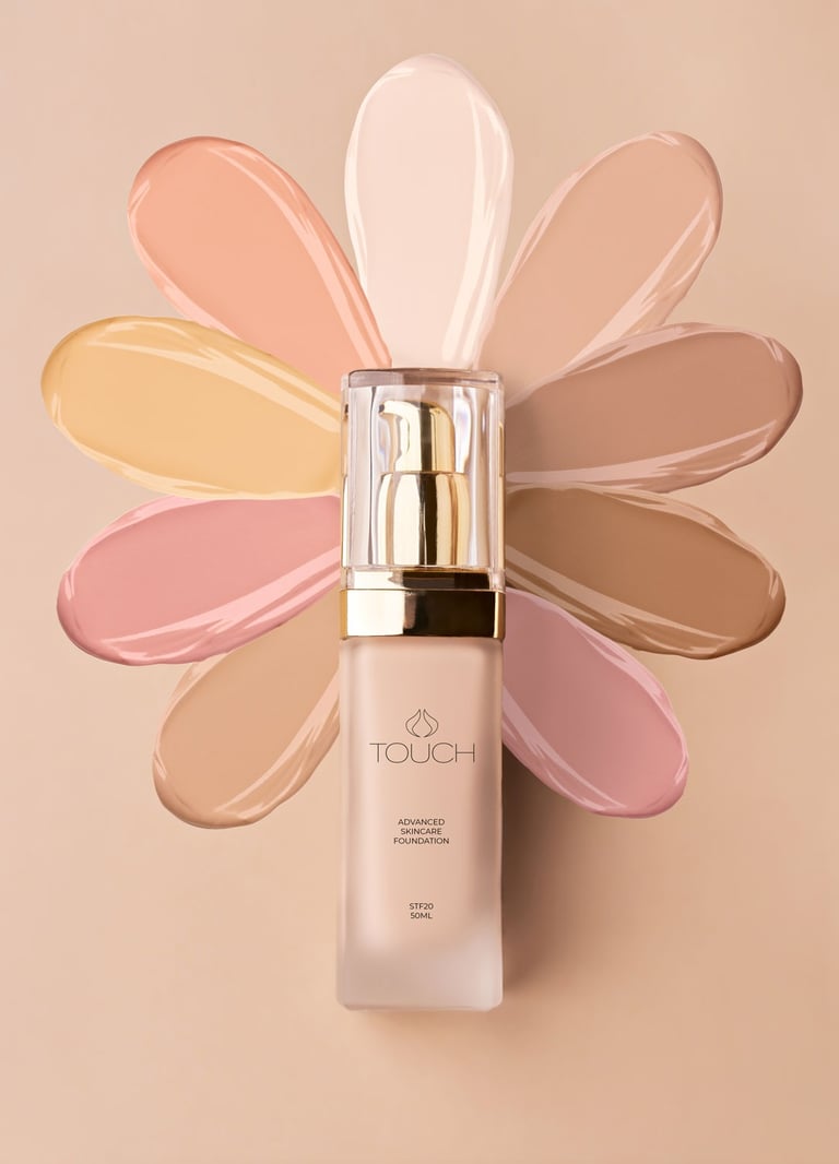
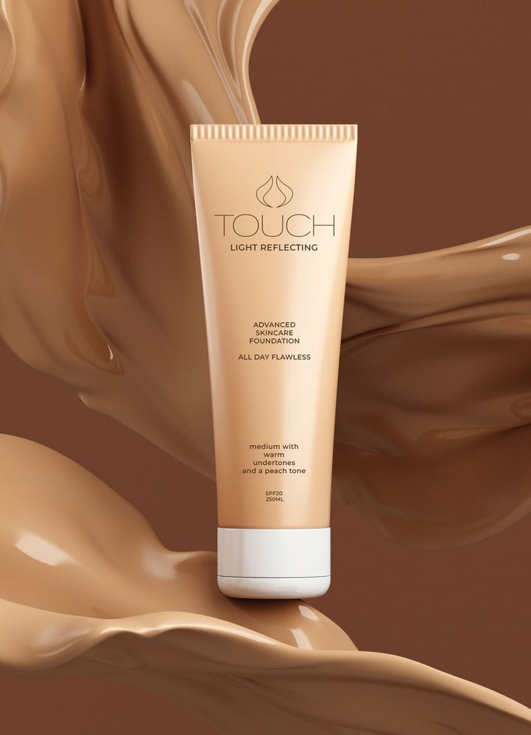
In this design project, I undertook the branding and visual identity creation for a cosmetic line named “Touch.” The brand essence revolves around femininity, elegance, and a sense of softness that reflects impeccable skin and beauty. The branding elements were meticulously crafted to evoke a romantic and emotional connection with the target audience.






Name Creation “Touch”
The name “Touch” was chosen to convey the essence of delicacy, grace, and the tactile experience of makeup application. It signifies a connection between the product and the user’s skin, emphasizing the emotional and intimate relationship between beauty and the individual.
Logo Design
The logo encapsulates the brand’s core attributes through a minimalist and sophisticated approach. The primary element is a subtle, refined san serif typography in black, symbolizing timeless elegance. A visual representation of two canary birds gently touching the skin forms an integral part of the logo. This motif is inspired by the idea of a gentle caress, reflecting the brand’s commitment to enhancing natural beauty. Alternatively, an opening flower bud serves as a symbol of transformation and renewal, mirroring the transformative power of makeup and skincare.
Color Palette:
Elegance and Earthy Tones, The color palette revolves around four key shades:
Black: Evokes sophistication,
timelessness, and elegance.
White: Symbolizes simplicity, clarity, and purity, aligning with the brand’s commitment to high-quality ingredients.
Brown and Beige: These earthy tones represent both the natural ingredients used in the products and the health of the skin. They create a warm and approachable feel.


WORK PROCESS
Project Overview:
You are tasked with creating a compelling and innovative brand identity for a new product. Your responsibilities include coming up with a unique name for the product, designing a memorable logo, developing cohesive stationery items, and creating an eye-catching poster to promote the product.
Introduction
In this design project, I undertook the branding and visual identity creation for a cosmetic line named “Touch.” The brand essence revolves around femininity, elegance, and a sense of softness that reflects impeccable skin and beauty. The branding elements were meticulously crafted to evoke a romantic and emotional connection with the target audience.


Name Creation “Touch”
The name “Touch” was chosen to convey the essence of delicacy, grace, and the tactile experience of makeup application. It signifies a connection between the product and the user’s skin, emphasizing the emotional and intimate relationship between beauty and the individual.
Logo Design
The logo encapsulates the brand’s core attributes through a minimalist and sophisticated approach. The primary element is a subtle, refined san serif typography in black, symbolizing timeless elegance. A visual representation of two canary birds gently touching the skin forms an integral part of the logo. This motif is inspired by the idea of a gentle caress, reflecting the brand’s commitment to enhancing natural beauty. Alternatively, an opening flower bud serves as a symbol of transformation and renewal, mirroring the transformative power of makeup and skincare.
Color Palette:
Elegance and Earthy Tones, The color palette revolves around four key shades:
Black: Evokes sophistication,
timelessness, and elegance.
White: Symbolizes simplicity, clarity, and purity, aligning with the brand’s commitment to high-quality ingredients.
Brown and Beige: These earthy tones represent both the natural ingredients used in the products and the health of the skin. They create a warm and approachable feel.

